The Death of Media Queries: How clamp() and Smart CSS Zoom Create Truly Fluid Websites

If you are still building websites by writing dozens of media queries (@media) for every single breakpoint, I have bad news for you. You are stuck in the 2000s.

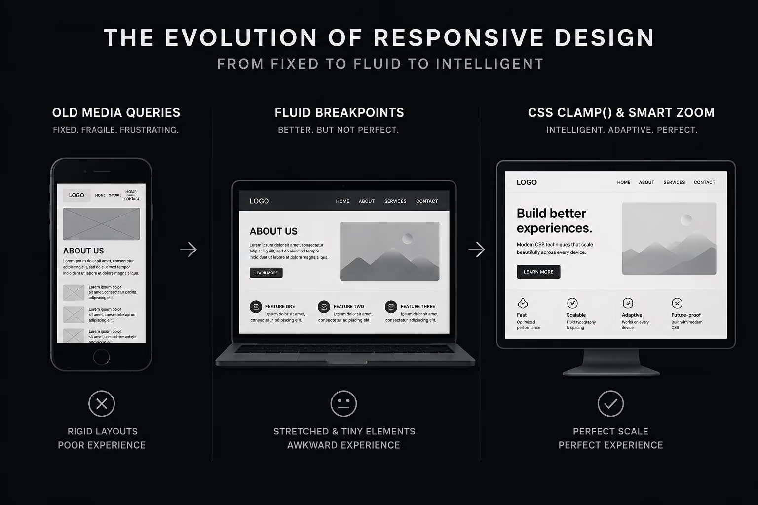
Back in the day, responsiveness was a wild frontier. We used to build entirely separate mobile websites on subdomains (like m.site.com) and then wrapped every single element in pixel-based breakpoints. Today, the landscape is entirely different. Monitors are massive, smartphones come in thousands of shapes, and users demand perfection.

Let’s look at why popular responsive methods fail today and how using clamp() combined with one clever CSS formula can create a perfectly “breathing” layout that stays flawless even on 8K screens.

Why Pixels and Fluid Responsive Fall Short

It seems like modern frameworks and builders (looking at you, Webflow) solved responsiveness long ago. But if you look under the hood, you’ll find two core issues:

  1. Broken Accessibility (WCAG). Many systems still rely heavily on pixels (px). If a visually impaired user increases their default browser text size, a pixel-based site completely ignores it. This is a direct violation of basic accessibility standards.
  2. The Fluid Responsive Pitfall. A trendy approach in fluid design is scaling everything down proportionally to the viewport width. The result? On narrow mobile screens, text becomes unreadably small, destroying the user experience. Ironically, if you look at the source code of the platforms promoting these fluid frameworks, they rarely use their own method on their corporate sites. Plus, they often mess with the HTML root size, stripping away user browser control.

To escape breakpoint hell, the web adopted the rem unit. But if you use rem blindly, you still have to write tons of media queries to stop text from becoming comically large on laptops.

My Choice: Math-Free clamp()

For my own and my clients’ projects, I’ve found the ultimate weapon: the CSS clamp() function. It allows us to use responsive units while keeping them securely locked within defined boundaries: you set a minimum size, a maximum size, and an ideal scaling value in between.

The result? Fonts and spacings smoothly expand and contract but never shrink below your minimum or grow past your maximum. The number of @media rules drops to near zero—we only use queries to rearrange layouts (using Flexbox or Grid), while the sizing handles itself.

Admittedly, calculating the exact vw middle value manually is a mathematical nightmare. To make life easy, I built a free tool: Clamp Generator by leggo.dev. Just input your target min and max values from your design, copy the generated CSS, and paste it into your project.

The Ultra-Wide Screen Problem (>1920px)

Standard clamp() works perfectly up to Full HD (1920px). At that point, it hits its maximum cap and stops growing to keep the layout from breaking. But what if a user opens your site on a 4K monitor or a massive TV? Do you just leave huge empty bars on the sides?

I’ve engineered a solution for this. It allows the entire website to scale fluidly and proportionally on ultra-wide screens while respecting accessibility and browser user preferences.

Add this code to the top or bottom of your main CSS file:

CSS

/* Scaling for ultra-wide displays (>1920px) */
@media screen and (min-width: 1921px) {
  :root {
    /* 
       Zoom multiplier. 
       0.00833 — strict proportion (1/120 of the width). 
       0.006 — subtle, restrained scaling.
    */
    --zoom-speed: 0.00833; 
  }

  html {
    /* 
       1. 1rem — the baseline that respects user browser settings.
       2. calc(...) — calculates the size delta based on how wide the viewport is past 1920px.
       3. clamp(...) — caps the scaling (min: 1rem, max: 2.5rem/40px for 8K setups).
    */
    font-size: clamp(
      1rem, 
      calc(1rem + (100vw - 1920px) * var(--zoom-speed)), 
      2.5rem
    );
  }
}

Why This Formula is a “Best Practice”

  1. 100% Accessible (WCAG Compliance). Unlike blindly using raw viewport units (e.g., font-size: 0.8vw), the calc(1rem + ...) formula adds a dynamic modifier directly to the user’s base font size. If a user sets their browser default font to 20px, the 4K scaling will accurately calculate from that 20px base.
  2. Seamless Fluidity. The layout doesn’t snap abruptly; it “breathes.” Every extra pixel of screen width beyond 1920px fluidly scales up all elements defined in rem.
  3. Smart Guardrail. The third parameter in clamp (2.5rem) ensures that the website never scales to a comical, unreadable size on giant display panels.

Customization Guide

ParameterValueDescription
--zoom-speed0.00833Maximum scaling. A 4K site (3840px) will look exactly like it does at 1920px, just physically larger.
--zoom-speed0.005 - 0.006Comfortable scaling. Ideal for content-heavy sites. It scales up moderately, leaving more breathing room.
Max Value2.5remThe Stop Threshold. The root font size will never exceed this value (40px), no matter the screen size.

Two Rules for the Magic to Work:

  • Use rem for everything: Margins, paddings, container widths, icons, and typography must be tied to the root font size.
  • Component-based clamp: Your inner components using values from my Clamp Generator will work seamlessly because they use rem as anchor points.

Stop writing endless media queries. Switch to smart fluid responsiveness and build websites that look spectacular on everything from an old iPhone to an 8K display.

The “Bloated Code” Syndrome: Why I’m Dropping GSAP and Swiper for Vanilla JS

Let’s be honest: modern web development has gotten lazy. Today, to trigger a simple fade-in animation or build a basic image gallery, developers blindly dump tons of third-party code into a project. Why write three lines of clean JavaScript when you can install a massive library, right?

Wrong. Every time I see a simple corporate website or a landing page running both GSAP (for animations) and Swiper.js (for a basic slider), I want to ask: “Why are you using a rocket ship just to cross the street?”

Let’s break down why the obsession with heavy libraries is hurting your business, and why I choose the path of “clean code” for my clients.

Overkill for Everyday Web

Don’t get me wrong: GSAP is an incredible tool. If you are building an advanced promo site with immersive 3D, WebGL, and complex scroll-driven storytelling, heavy artillery is justified. Swiper is an excellent engine if you need nested galleries, dynamic virtual slides, and dozens of custom transitions.

But for 90% of standard websites, these flashy features are completely unnecessary.

When you plug in Swiper just to scroll through three client testimonials, you force your user’s browser to download, parse, and execute megabytes of useless code. The result? The site stutters on mobile devices, and your Google PageSpeed scores drop into the red.

My Solution: A Slider on a “Diet”

This is exactly why I stopped blindly relying on bloated, one-size-fits-all plugins and built my own custom slider. You can see it in action and test it right on this page.

It doesn’t have fancy 3D perspectives, but it:

  • Performs its core job flawlessly.
  • Weighs a fraction of what popular libraries do.
  • Contains zero lines of junk code.

For everyday animations—like elements fading in on scroll, basic tabs, or mobile menus—plain vanilla JavaScript is more than enough. It runs faster, consumes less memory, and doesn’t rely on third-party maintainers.

The Myth of Modern CDNs

Another common mistake is linking these massive libraries through external CDN links.

Years ago, it was believed that CDNs speed up the web because files might already be cached in the user’s browser. In the modern web, due to updated browser security and caching policies, this argument is dead. Using an external CDN just creates unnecessary requests to third-party servers. While the browser connects to a foreign host and resolves the DNS, your user is losing precious milliseconds.

My Rule: If a project absolutely demands a large library, skip the CDN. Host the file locally on your own server or inline the essential code. Local assets load faster and are inherently more secure.

The Takeaway

I meticulously audit every single script I implement for myself and my clients. The web needs to be fast. It’s time to stop bloating websites with heavy scripts for basic UI elements.

I’ve largely moved away from GSAP and massive plugins in favor of clean, vanilla JS—and your website will thank you with higher search rankings and better conversion rates.

Why traditional CMS and pure static sites will disappoint you — and why the future is hybrid.

Let’s be honest: the perfect Content Management System doesn’t exist. Or rather, it didn’t exist — until we started combining the best of two completely different worlds.

Every time developers and businesses choose a platform for a new project, they are forced to compromise. It’s always a trade-off between easy content editing, performance, and security. After observing this struggle for years and testing various approaches on my own and my clients’ projects, I’ve found the ultimate setup that I now fiercely advocate for: a Hybrid CMS (headless / decoupled) — specifically, the WordPress + static link.

Let’s break down why traditional methods are losing ground, and how the hybrid model solves everyone’s pain points.

The three dilemmas of modern web development

When you choose a classic route, you inevitably hit one of three walls:

  • SaaS page builders (Webflow, Shopify, etc.). Yes, they look great and are fast to build. But they trap you in a cycle of expensive monthly subscriptions. You don’t own your website 100% — you are essentially renting it. Want to migrate your data or customize a complex feature? Good luck.
  • Pure static sites (JAMstack / hardcoded / AI-generated). It’s trendy right now to generate sites via AI or write raw code. They fly, and they are secure. But only until the client needs to change a banner, add a product, or rewrite a paragraph. Then the nightmare begins: you either ask AI again (which might break the layout) or hire an expensive developer for a minor tweak. Without a dashboard, a business is blind.
  • Traditional WordPress (and other open-source CMS). The good old giant. It’s incredibly user-friendly for content managers, but heavy on the server. It drags along a database, PHP, and a pile of heavy plugins. And most importantly: security. Without paranoid-level configuration, a standard WP site is an open target for hackers, malware, and brute-force attacks.

Hybrid WordPress + static: how it works

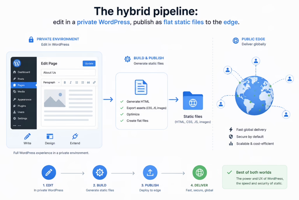
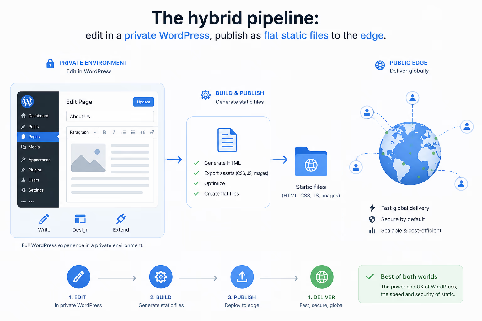
The solution I use for myself and my clients bridges the gap between a familiar backend and an un-hackable frontend. The concept is simple: we spin up WordPress on a closed local machine or a hidden, isolated server with zero public access. The client logs into the familiar, intuitive WP dashboard to write articles, swap images, and tweak SEO settings.

However, the moment they hit Publish, a dedicated deployment process converts that heavy, database-driven site into clean, ultra-fast static HTML / CSS / JS files and pushes them to a public server (CDN).

Private WordPress  ──edit & Publish─→  Static generator
  (no public access)                       │
                                           ▼
                          Flat HTML / CSS / JS  ──deploy─→  Public CDN
                          (no DB, no PHP, no login page)

Why it is way better and more secure

Here is what falls out of that single architectural decision:

  1. Bulletproof security. There is literally nothing to hack on the public server. No database, no PHP execution, no backend login page. Cybercriminals can scan the site all day long — all they will find is a flat wall of static files.
  2. Blazing fast speed (a huge SEO win). According to Google’s research, a mere 1-second delay in mobile load times can impact conversion rates by up to 20%. A static site delivers pages instantly because the server doesn’t have to assemble them from a database on the fly. Your Google Core Web Vitals will hit the green zone effortlessly.
  3. Zero developer dependency. The client regains full independence. No need to pay for pricey subscriptions or call a developer to fix a typo. The WordPress dashboard remains exactly as easy as it has always been.
  4. Dirt-cheap hosting. Static files can be hosted on free or ultra-cheap global CDNs (like Cloudflare Pages, Netlify, or Vercel). They can handle massive traffic spikes without sweating or crashing.

According to Google’s research, a mere 1-second delay in mobile load times can impact conversion rates by up to 20%. The cost is paid at the exact moment buyer intent is highest.

Rule of thumb: keep the editing experience rich and dynamic in private, and keep the public surface as dumb and flat as possible. The smaller the public attack surface, the faster and safer the site.

The takeaway

Hybrid architecture isn’t just a trend; it’s common sense. We are taking the best asset of the old web — WordPress’s unmatched content management — and merging it with the best of the new web: the speed and security of static architecture.

If you’re tired of dealing with constant security vulnerabilities, or sick of “renting” your website from closed platforms, it’s time to go hybrid. It’s tried, tested, and proven by both myself and my clients.