The Death of Media Queries? How clamp() and a Smart Root Scale Make Truly Fluid Websites
Open the stylesheet of a typical website and count the @media blocks. It is not unusual to find dozens: one set of font sizes for phones, another for tablets, another for laptops, another for big desktops, each one nudging headings and paddings a few pixels up or down. Every new component adds more. Every redesign means hunting through all of them.
I stopped writing most of those. Today almost all sizing on my sites, from headings and paddings to gaps and icons, is handled by CSS clamp(), and wide screens are handled by one small rule on the root font size. Media queries are still there, but only for what they are good at: changing the layout. Here is how the approach works, including one trap I found while testing it that most articles on fluid design don’t mention.
The short version: size everything in rem, let clamp() scale values smoothly between a minimum and a maximum, and keep media queries for layout changes only. For very wide screens, a gentle root scale lets the whole site grow, as long as you keep browser zoom working.
Why breakpoint-by-breakpoint sizing doesn’t hold up
Responsive design started with a few predictable screens. Some of us still remember separate mobile sites on m. subdomains. Now a site has to work on everything from a small phone to a 49-inch ultra-wide monitor, and the space between the “official” breakpoints is where things break: a heading that fits at 768px wraps awkwardly at 900px, a hero looks empty at 1700px. More breakpoints only move the problem around.
There are two common escapes from this, and both have a catch.
Catch #1: pixels ignore the user’s text size
Every browser lets people choose a default font size. Many people with low vision set it to 20px or more instead of the standard 16px. Text sized in px ignores that setting completely. Browser zoom still works, so it is not automatically a WCAG failure, but you are overriding a choice the user made on purpose. Sizes in rem respect it for free, because 1rem equals whatever the user picked.
Catch #2: pure viewport scaling breaks mobile and zoom
The popular “fluid responsive” trick is to tie everything to the screen width, for example html { font-size: 0.833vw; }, so the whole design scales like a picture. It looks great on the designer’s monitor. On a 375px phone it gives you 3px text, so you need breakpoints again to rescue mobile. It also overrides the user’s font-size setting, and worse, it neutralises browser zoom: zooming in makes the viewport narrower in CSS pixels, so the text shrinks back by the same amount. WCAG 1.4.4 requires that text can be resized to 200%, and pure vw text can’t be.
The fix: clamp() with rem at both ends
clamp(min, preferred, max) is supported in every modern browser and does exactly what the name says. The value grows with the screen, but never drops below the minimum or goes past the maximum:
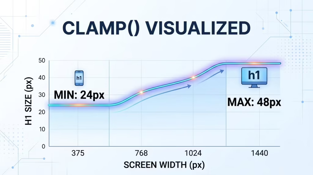
/* 24px on a 360px phone, 48px from 1440px up, smooth in between */
h1 {
  font-size: clamp(1.5rem, 1rem + 2.222vw, 3rem);
}
The important detail is the middle value: 1rem + 2.222vw, not just vw. The rem part keeps the user’s font-size setting and browser zoom in play, and the vw part adds the growth. The minimum and maximum are in rem as well, so they respect the user too.
Use the same pattern for padding, margins, gaps and section spacing, and something nice happens: the sizing takes care of itself. My media queries now do only layout work, like switching a grid from one column to three or showing a mobile menu. On a typical site that is a handful of rules instead of dozens.
One accessibility rule for clamp()
Keep the maximum at no more than 2.5 times the minimum. Maxwell Barvian showed in Smashing Magazine that this keeps fluid text resizable to 200% in modern browsers. clamp(1.5rem, …, 3rem) is fine (2×). clamp(1rem, …, 4rem) is not (4×).
Skip the maths: the Clamp Generator
The only annoying part is the middle value. You need the slope between two points (how much the size grows per pixel of screen) converted to vw, plus the starting offset in rem. It is school maths, but nobody wants to do it forty times per project.
So I built a free Clamp Generator. You enter the smallest and largest size from your design and the screen widths they belong to, and it gives you a ready clamp() line to paste into your CSS.
What happens above 1920px
Most designs stop at around 1440 to 1920px, and so do the clamp() maximums. On a 2560px monitor at 100% scaling, an ultra-wide display or a TV, the site simply stops growing. You get a comfortable column in the middle of a sea of empty space, with text that looks small from a normal viewing distance.
Since everything is in rem, there is an elegant fix: grow the root font size on wide screens, and the whole site grows with it, clamps included.
/* Scale the whole site on screens wider than 1920px */
@media screen and (min-width: 1921px) {
  :root {
    /* How fast the site grows past 1920px.
       0.005 = gentle (recommended), 0.00833 = strictly proportional */
    --wide-scale: 0.005;
  }

  html {
    /* 1rem here is the user's own default font size,
       so their setting stays the starting point. */
    font-size: clamp(
      1rem,
      calc(1rem + (100vw - 1920px) * var(--wide-scale)),
      2rem
    );
  }
}
Below 1921px nothing changes. Above it, every extra pixel of width adds a little to the root size, smoothly, with no jumps. Because the formula starts from 1rem (inside the html rule, that is the browser’s default size), a user who set 20px as their default still starts from 20px. The last value is a hard cap, so even a giant screen never gets a comically large site.
The trap I found while testing: zoom
My first version used the strictly proportional rate, 1/120 (0.00833), so a 3840px screen looks exactly like 1920px, just twice as big. Then I tested it with browser zoom in Chromium, and the numbers were uncomfortable:
| Screen width, zoom | Root size with 0.00833 | Root size with 0.005 |
|---|---|---|
| 3440px, 100% | 28.7px | 23.6px |
| 3440px, 125% | 28.7px (no change) | 25.2px |
| 3440px, 200% | 32px | 32px |
| 3840px, 100% | 32px | 25.6px |
| 3840px, 200% | 32px (no change) | 32px |
Effective root font size on screen, measured in Chromium. The limit was 2.5rem in this test.
Zooming in makes the viewport narrower in CSS pixels, so the width-based part of the formula shrinks as fast as the zoom grows. With the strict rate the two cancel out exactly, and on a 4K screen at 100% scaling the first zoom steps do literally nothing. Text can still be enlarged if the user keeps zooming past 200%, and a cap of no more than 2.5× keeps it within WCAG’s resize-text rule. But to a real person, a zoom button that does nothing feels broken.
That is why my defaults are a gentler rate (0.005) and a lower cap (2rem). The site still grows noticeably on wide screens, and every zoom step still makes things bigger.
| Setting | Value | What it does |
|---|---|---|
--wide-scale |
0.004–0.005
|
Recommended. Clear growth on big screens, zoom still responsive. |
--wide-scale |
0.00833 |
Strictly proportional: 3840px looks like 1920px at double size. Zoom barely reacts on wide screens. |
| Cap | 2rem |
The root size never goes above 32px (with default settings). Keep it at 2.5rem or less. |
One more real-world note: most 4K monitors run with 150% or 200% scaling in Windows or macOS. The browser then reports 2560px or 1920px, not 3840px. So in practice this rule matters most for 2560px monitors at 100%, ultra-wide displays and TVs.
Two rules that make it work
-
Everything in rem. Font sizes, paddings, margins, gaps, container widths, icon sizes, border radii. Anything in
pxwon’t follow the user’s setting or the wide-screen scale. Hairline borders are the only thing I leave inpx. -
Every clamp() anchored in rem. Minimum, maximum and the
rempart of the middle value. That is what the Clamp Generator outputs, so its values scale together with the root.
So are media queries dead?
No, and the headline of this post is only half serious. They have just gone back to their real job. I use media queries to change layout: stack columns on phones, move the navigation into a menu, and respect prefers-reduced-motion. For components that live in columns of different widths, container queries (@container) are often a better fit than media queries, because the component reacts to its own space, not to the whole screen.
What I no longer write is the endless list of “font-size: 18px at this width, 20px at that width”. That part is gone, and I don’t miss it.
FAQ
Is clamp() supported in all browsers?
Yes. It has worked in Chrome, Edge, Firefox and Safari since 2020, so no fallback is needed for current browsers.
Is fluid typography accessible?
It can be, if you set the minimum and maximum in rem, include a rem part in the middle value, and keep the maximum at no more than 2.5 times the minimum. Pure vw font sizes are not accessible because browser zoom can’t enlarge them.
Should I set html { font-size: 62.5%; }?
You can, since a percentage still respects the user’s setting, but I don’t. It makes 1rem equal 10px, which is too small for body text, so you end up sizing every text element again. I keep the browser default and think in rem directly: 1rem, 1.125rem, 1.5rem.
Does this work in Webflow or WordPress builders?
Yes. Any field that accepts a CSS value accepts clamp(), and the wide-screen rule goes into your global CSS or custom code area once.
The takeaway: let clamp() handle sizes, let media queries handle layout, and let the user’s settings stay in charge. Then test the result the way real people use it, with browser zoom and a larger default font, not just by dragging the window.
Want your site to look right on every screen without a pile of breakpoints? Tell me about your project, or start with the free Clamp Generator.
Keep reading.
Three more, still opinions, still with numbers attached.

The AI Web Design Hype: Why Clean Code and Real UX Still Win
“I built an award-winning website in two hours with AI.” If you spend any time on YouTube or X, you have seen…
The “Bloated Code” Syndrome: Why I Stopped Reaching for GSAP and Swiper
Open the source of an average corporate website and you will often find the same pair of guests: GSAP for animations and…
Traditional CMS vs Static Sites: Why I Build Hybrid WordPress
Almost every project I start begins with the same question: “Should we build it on WordPress, go with Webflow, or just make…