Case 02/ 04
Paintgun
a video-first Webflow site that still paints in under a second
Visit live site (opens in a new tab)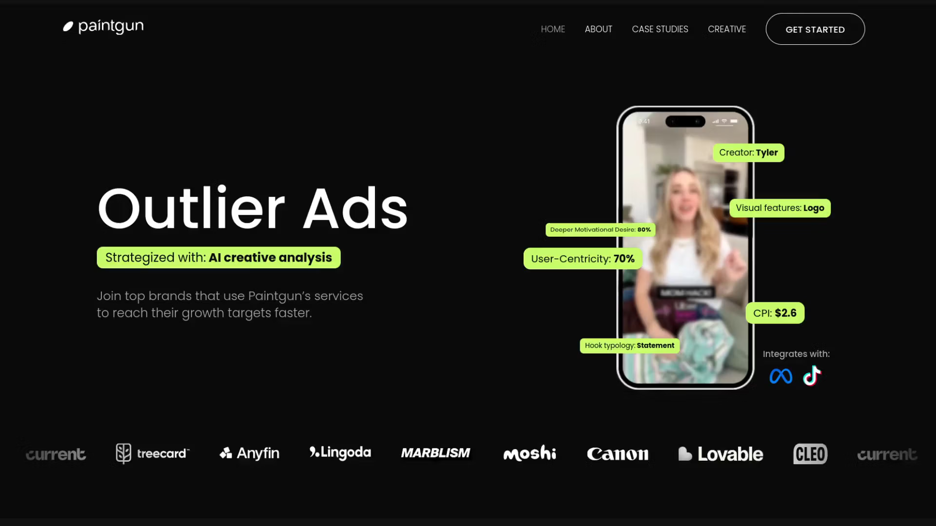
Project facts
- Industry
- Ad creative agency
- Platform
- Webflow
- Year
- 2024
- Stack
- Live site
- paintgun.io (opens in a new tab)
- 99Lighthouse performance
- 0.8 sLargest Contentful Paint
- 100Lighthouse accessibility
Key resultLighthouse 99, LCP 0.8 s
Almost every section of Paintgun’s design runs on background video. I built it in Webflow with a custom loader that fetches each video just before it’s needed, so the site kept its look and still scored 99 in Lighthouse.
The brief
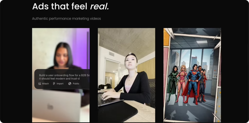
Paintgun is a full-service ad creative agency that uses AI to analyse ad creatives for brands like Canon, Lovable and Cleo. Their work is video, so their website is too: almost every section of the Figma design sits on top of a looping background video.
The job was to build that design in Webflow exactly as drawn, with no static images standing in for the videos, and still have a site that opens fast on a phone. For an agency that sells performance, a slow website would undercut the pitch before the first scroll.
Why video-heavy sites are slow
The problem isn’t video itself. It’s when the browser asks for it. With Webflow’s standard background video, every video on the page starts downloading as soon as the page loads, including the ones at the very bottom that most visitors never reach. On mobile data, that means megabytes of video competing with the text and images the visitor actually needs first.
On top of that, phones have their own rules. Safari and iOS can refuse to autoplay video, Low Power Mode blocks it entirely, and a video sized for a 27-inch monitor is wasted on a 6-inch screen.
The build
I built the layout in Webflow from the Figma file, responsive across desktop, tablet and mobile, and replaced the standard video behaviour with a small lazy-loading script in plain JavaScript:
- No video in the initial page. Each section only describes its video in three data attributes: the desktop file, the mobile file and a poster image. The page loads with lightweight WebP posters instead.
-
Load just before it’s needed. An
IntersectionObserverwatches the sections and creates the video element shortly before a section scrolls into view, so it is already playing when the visitor gets there. - The right file for the screen. A media query picks the smaller mobile video on phones and the full-quality one on desktops.
- A clean fallback. If the browser refuses autoplay (Safari, iOS Low Power Mode), the poster simply stays in place. No broken player, no play button in the middle of the design.
All videos were compressed to MP4 and every image optimised, then the result was checked in Lighthouse and on real devices rather than only in desktop DevTools.
Easy for the team to update
Performance tricks are often fragile: the developer leaves and nobody dares to touch the page. Here, adding a new video section takes three fields in the Webflow Designer, with no code to edit. The script finds the new section on its own.
The result
The design shipped exactly as drawn, videos everywhere, and the site still scored in the green at launch: 99 for Lighthouse performance, 100 for accessibility and best practices, a Largest Contentful Paint of 0.8 s and zero blocking time. The first screen appears almost instantly, and each video arrives just in time for the section it belongs to.
Use it on your site
I turned the video loader from this project into a free tool, Smart Background Video, so you can use the same approach on any Webflow or WordPress site. If you have a video-heavy design and want it built without the usual slowdown, take a look at my Webflow development and Figma to website services, or speed up a site you already have.