Paintgun — a video-heavy Webflow site that still loads fast
Nearly every section of the design is carried by video. We rebuilt how the page requests its media, so the showreel survived and the first paint did too.
An agency that sells attention, on a page that had to earn it
Paintgun is a full-service creative agency that uses AI-powered analysis to help brands produce and improve advertising content. Their site works like a showreel: the work is the argument, so it plays rather than sits still.
We received a finished Figma design and were responsible for everything after it — the Webflow build, responsive behaviour across desktop, tablet and mobile, asset preparation, and the custom JavaScript that decides when each video is allowed to load.
Our role
- Complete Figma-to-Webflow development
- Responsive implementation across desktop, tablet and mobile
- Image and video compression and optimisation
- Custom background-video lazy-loading system
- Separate desktop and mobile video sources
- Safari, iOS and Low Power Mode handling
- Performance testing and tuning before handover
Stack
- Webflow — structure, styling, CMS-editable content
-
Vanilla JavaScript with
IntersectionObserver - Figma as the single source of design truth
- Compressed MP4 sources with WebP posters
- Lighthouse and real-device testing
Keep the video. Lose the wait.
The design relies on video to present Paintgun’s capabilities. Loading every file when the page opened would have meant megabytes of traffic before a visitor read a single line — a slow first render, and a performance score that quietly contradicts the pitch.
The task was to preserve the visual impact of the original design without letting the amount of media decide the loading time. That left us a specific set of constraints:
- No cutting sections and no static substitutes — the design ships as designed.
- Webflow’s native background video requests its source as soon as the section exists in the DOM.
- Desktop needs horizontal crops, mobile needs vertical ones — and neither should download the other.
- Safari, iOS and Low Power Mode refuse autoplay in cases we do not control, and a refused video must never leave an empty rectangle.
- The client’s team edits the site afterwards, so adding a video section cannot require a developer.
The video element does not exist until the section is close
Rather than let the browser discover every source at load, we build the video elements ourselves — and only once a section is approaching the viewport. Each section declares its own configuration in data attributes, so the markup carries the intent and the script carries the behaviour.
-
Declare Each section holds its desktop source, mobile source and poster as data attributes. No video element is in the document yet, so nothing is requested.
-
Observe One
IntersectionObserverwatches every marked section with a root margin ahead of the viewport, so the load starts before the section is on screen. -
Pick the right file A media query decides between the horizontal and vertical source before the request goes out — a phone never pays for the desktop crop.
-
Build and play The script injects a muted, looping, inline video and starts playback when it is ready. The poster holds the frame until then, so there is no flash of empty panel.
-
Fall back cleanly If autoplay is refused — Safari, iOS, Low Power Mode — the poster stays as the final image and the section still reads as designed.
Because the behaviour lives in attributes rather than in bespoke code per section, the client’s team can add a new video panel in Webflow by filling in three fields.
The same system, documented and packaged with ready-to-use code — free to drop into any site.
Smart Background Video
Green scores with the media still in place
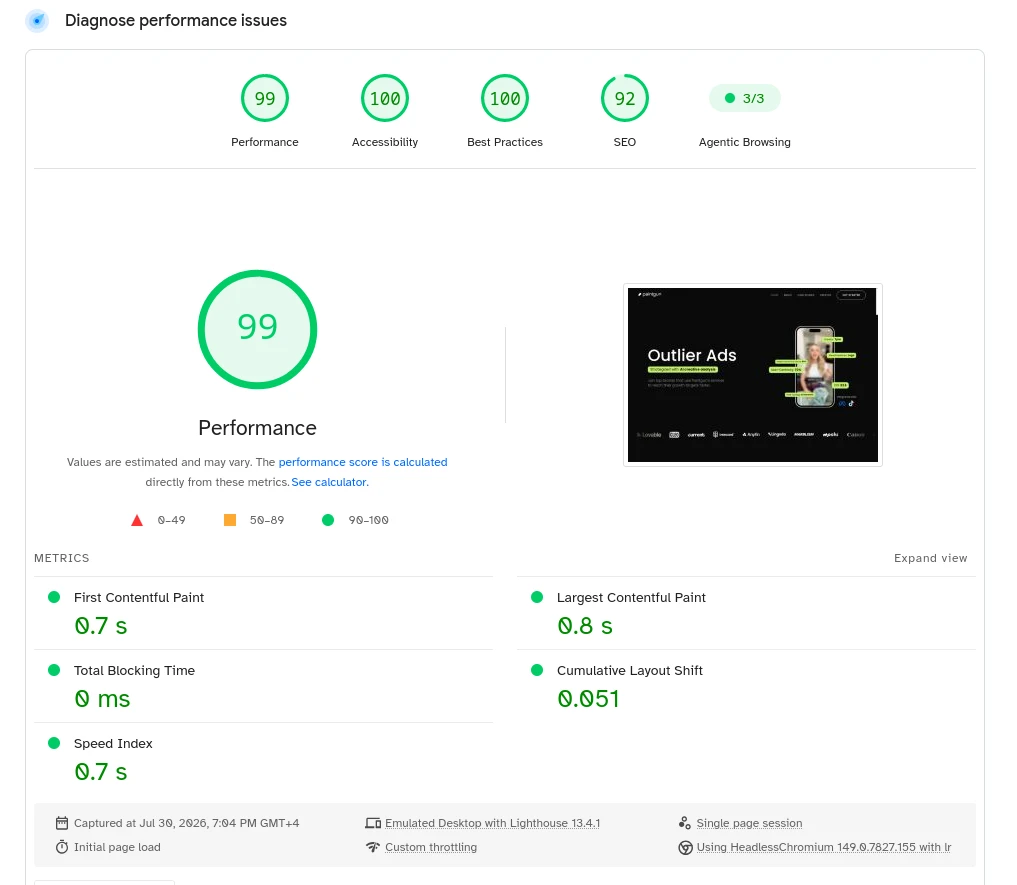
All image and video assets were prepared and compressed for web delivery. Combined with conditional loading, the site kept its media-rich presentation and still measured in the green at handover.
Lighthouse, measured at delivery. Nothing was removed from the design to get there — the gain came from loading each asset at the right moment.
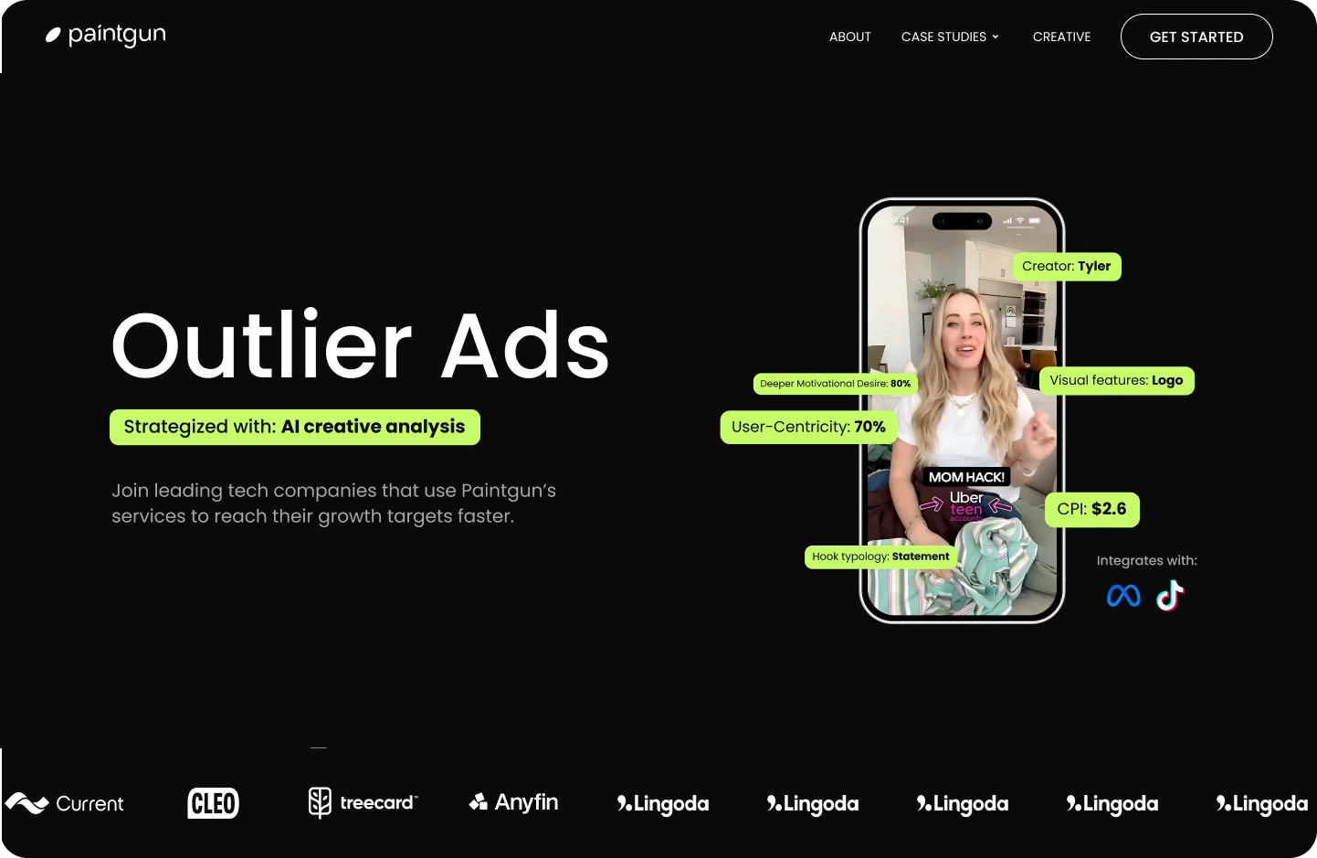
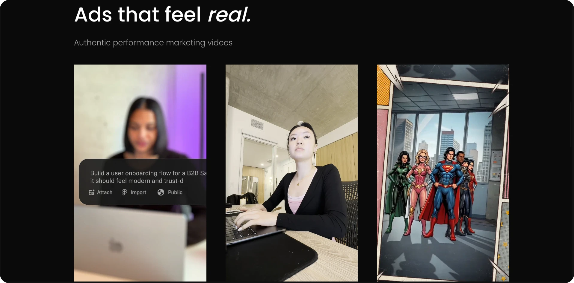
Screens from the delivered site
What we would do differently
- Generate posters automatically. Exporting a first-frame poster by hand is the step most likely to be forgotten when a new section is added later. Pulling it from the video during asset prep removes that risk.
- Move the sources behind a media CDN. Per-device transcodes would replace the second manual export and give us finer control over bitrate per breakpoint.
- Ship a QA view with the site. A small page listing every video section and its current load state is faster to check than scrolling the whole site after each edit.
Media-heavy site, mediocre scores?
Send us the URL. We will tell you where the weight actually sits and what it would take to keep the design and the speed.
Get Your Free Audit